Duo AI — Consumer Redesign
Client
Personal Project
Year
2026
Services
Product Design
UI
Frontend
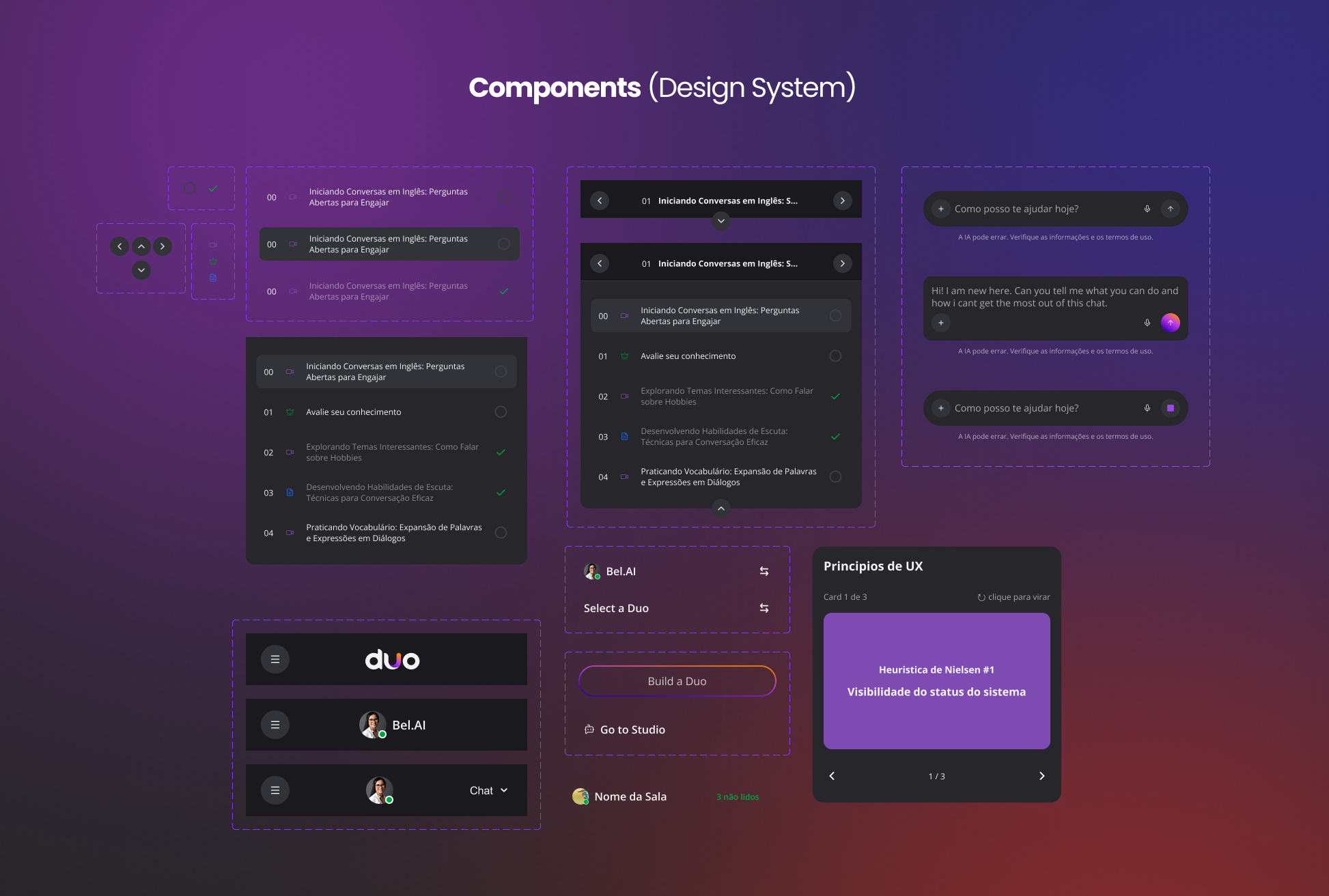
Design System
Claude Code
Context & Challenge
Duo AI is a platform where creators build and sell AI agents (DUOs) to their audiences. The creator side (Studio) had already received significant design investment — but the consumer side, where the buyer spends 90% of their time, was lagging: inconsistent patterns, confusing hierarchy, broken light mode in several places, and an overall "internal tool" feel instead of "market-ready product."
Before the public launch, we decided to raise the craft bar across the entire layer.
My Role
Product Designer responsible for the end-to-end redesign of the consumer surfaces: UX decisions, Figma design, and direct implementation in code (Next.js + Tailwind) using Claude Code.
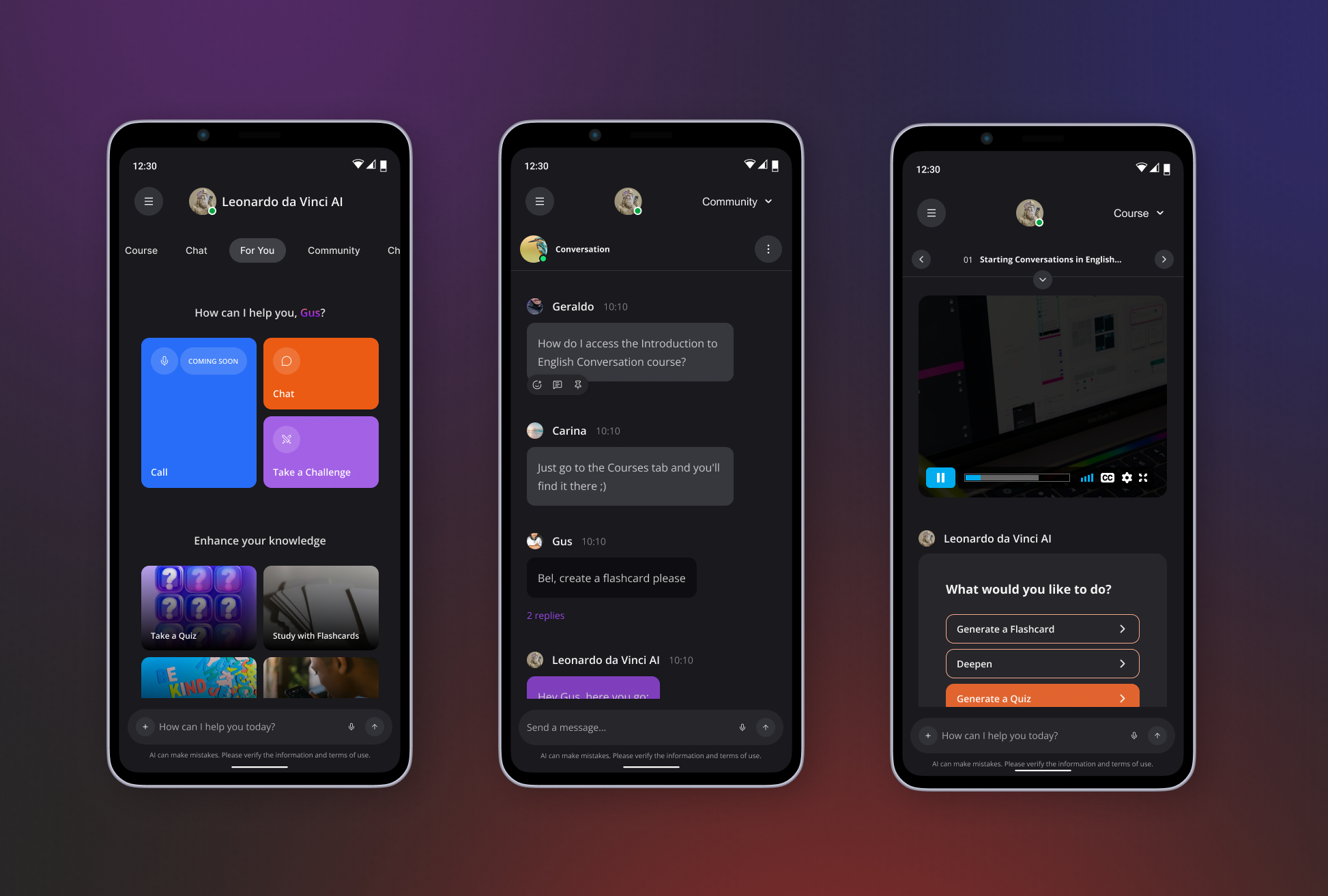
Scope: sign-in (split-screen on desktop, progressive disclosure on mobile), Agents page (redesigned cards, desktop pagination, horizontal scroll on mobile), header (AppPageLayout with centered avatar), sidebar (three sections: My DUOs, Rooms, Conversations), and full light mode migration to semantic tokens. Upcoming: chat, signup, forgot-password, Trial/Expired AgentCard variants, and a "Chat" header variant.
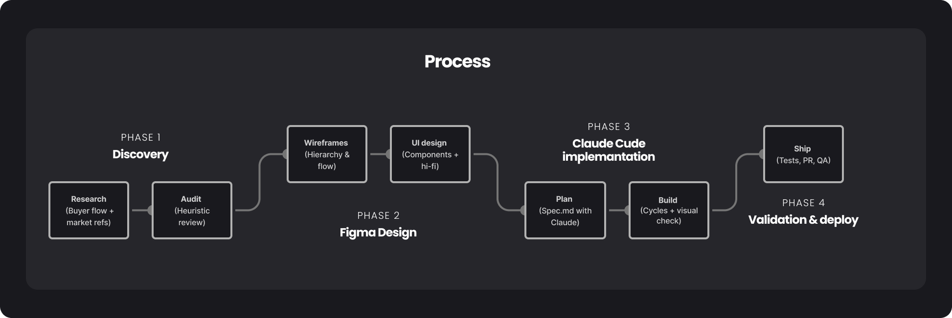
Process
**Figma as source of truth.** I structured the Figma file as the single reference. Every UI decision had to exist there before becoming code — this avoided rework and gave me a place to discuss visual trade-offs without implementation noise.
**Implementation with Claude Code.** As a UX Designer with beginner-level coding skills, this kind of redesign would normally require handoff to an engineering team and be spread across multiple sprints. With Claude Code, I took everything from Figma to PR myself. The flow became: I present the Figma screen and context → Claude researches the codebase and returns a change plan → I approve (or adjust) the plan → implementation happens in short cycles, with my visual verification between each phase. This isn't "vibe coding." It's design with a closed loop between intent, decision, and execution — without losing control of the product.
**Design system as guard-rail.** An expensive lesson: on the first pass of the sidebar and AgentCards, we used hardcoded colors (stone-85, stone-98). It worked in dark mode, broke in light mode. We had to redo it all using semantic tokens (background-tint-02, text-text-01, border-border-01). That mistake became a rule: no hardcoded colors in components — always semantic tokens that adapt between themes.
**What I learned working with Claude Code as a Product Designer.** Code research comes before implementation — I forced Claude to always read full files and map what exists before proposing changes, which eliminated 80% of generic solutions. Plan before PR — every large task starts with a .docs/Spec.md document that I review and approve before implementation. Memory is leverage — recurring feedback (like the semantic tokens lesson) lives in a persistent layer, and future projects start with that context loaded. I'm still the Product Designer; Claude implements, but the decisions on hierarchy, tone, flow, and priority are mine. The tool amplifies — doesn't replace — design judgment.
Key Decisions
Mobile sign-in with progressive disclosure
on mobile, the email/password form is hidden behind a secondary CTA ("or sign in with email"). Google OAuth gets primary focus. The hypothesis: most users in the creators' audiences are already logged into Google, and showing 4 fields upfront adds friction without lifting conversion.
Sidebar reorganized into three mental layers
instead of a flat list, I split it into "My DUOs" (what I bought), "Rooms" (where I participate), and "Conversations" (history). Mirrors how the user thinks, not how the backend models.
Centered header with avatar as anchor
the current DUO's avatar sits at the center of the header, not the corner. It's the most important piece of the screen at any moment — where the user is talking, with whom, in what context. Pulling it out of the periphery changed how the product feels.
Semantic tokens as design system contract
after the hardcoded color incident, any color in a component became required to be a semantic token. This became part of the project's memory, not a "we'll try to remember" — which unlocked light mode across the entire experience without redoing it on every new screen.
Results
Five consumer surfaces redesigned and shipped to production (sign-in, agents, header, sidebar, light mode)
Light mode working across the entire experience via semantic tokens
Consistent design system, with patterns ready to be replicated on upcoming screens (chat, signup, AgentCard variants)
Proved that a Product Designer with beginner-level coding skills can, with the right setup, take a full redesign from Figma to code while keeping craft quality and iteration speed