Hotmart: Online Events
Client
Hotmart
Year
2022
Services
Product Design
UX Research
Mobile
Usability Testing

Context & Challenge
FIRE is Hotmart's annual event. In the online edition, attendees watched talks through the events product: several stages at once, streams in more than one language (including Brazilian Sign Language), chat, and VIP ticket sales.
Most of the audience joined from a phone, and the product had been born on desktop. It showed up in support and NPS. Many people got stuck at login asking for a new password. Those who got in couldn't find the live stream, and few knew how to switch stage or language. At several points in the journey, someone with a problem had nobody to ask.
My Role
Product Designer and UX Researcher on the project end to end: service mapping, product and market research, screen design, critique facilitation, usability testing, handoff, and monitoring during the event.
Process
**Map the service before the screen.** The first question was how to deliver a good experience from the start of the event to the end, outside the player as well as inside it. I built a service blueprint with every journey stage, the attendee's and Hotmart's goal at each one, the touchpoints, and the teams involved. It drew on an analysis of the current flow, interviews with stakeholders and attendees, open-ended feedback from event NPS, an access survey, and page click data.
**Organize the evidence.** I used Atomic Research to separate experiment, fact, and recommendation. Two recommendations drove the rest of the project: focus on mobile, and fix navigation and the way people watched the stream and used the chat.
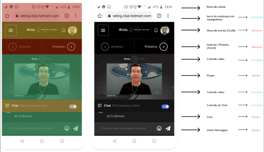
**Choose fast on a short deadline.** With the event close, the question became what to prioritize. I benchmarked features and components across YouTube, Facebook, LinkedIn, Twitch, Livestorm, and Hopin. Then I ran a heuristic review of the mobile screens where every element got a fate: hide, remove, or keep.
**Validate before shipping.** The prototype went through a design critique with Product, Design, Dev, CX, and the Events team, then an unmoderated usability test on Maze. Event tracking was defined in the handoff. During FIRE, I followed heatmaps on Hotjar and added a question about the experience to the event NPS.
Key Decisions
Passwordless login
attendees sign in with their email, no password to remember. "Forgot my password" was the first barrier in the journey and flooded the support queue right when the event started.
"Streaming now" on the home and in the menu
when a stage is live, it becomes the first card on the home screen and the first item in the menu. Before, the live stream shared space with course modules and recordings.
Video and chat up front
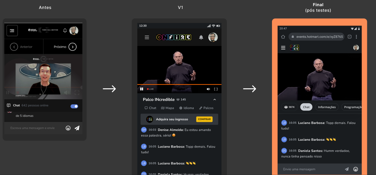
the stream screen lost the controls inherited from the courses product (previous, next, course menu). What stayed: the player, the chat, and a bar with what matters during the stream.
Stage and language without leaving the stream
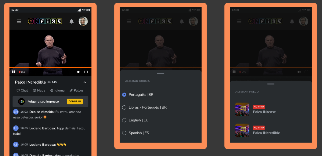
switching opens in a bottom sheet over the video, listing live stages and available languages, sign language included.
Testing killed a shortcut
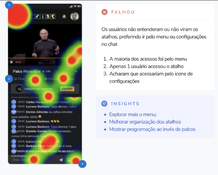
on Maze, getting to the stream worked. The stage-switching shortcuts went mostly unnoticed. People used the menu or looked for a settings icon. In the final version, switching moved into the player settings, the tabs were reorganized, and the schedule replaced the list of stages.
Upsell inside the event
a fixed banner on the home screen and a countdown offer over the video for attendees on a free ticket.
Results
Clicks on "forgot my password" became rare, and most attendees signed in through passwordless access
More attendees joined the event from their phones
High completion on the tasks of finding the stream and switching stage and language
More free attendees upgraded their ticket than in previous events
Positive feedback on the experience in the event NPS